
Hello Gelato
Brand Identity / Logos
Print (Ads, Menu Boards / Signage)
Social Media / Photography
I initially began this project working with the logo. The owner, Stephen, wanted to rebrand to target his audience better and to have all his assets in a cohesive manner. Then, I further assisted on re-creating the menu boards and name tags for the gelato. To help make a presence in the social media world, I also began their first instagram to reach customers that have never heard of Hello Gelato.
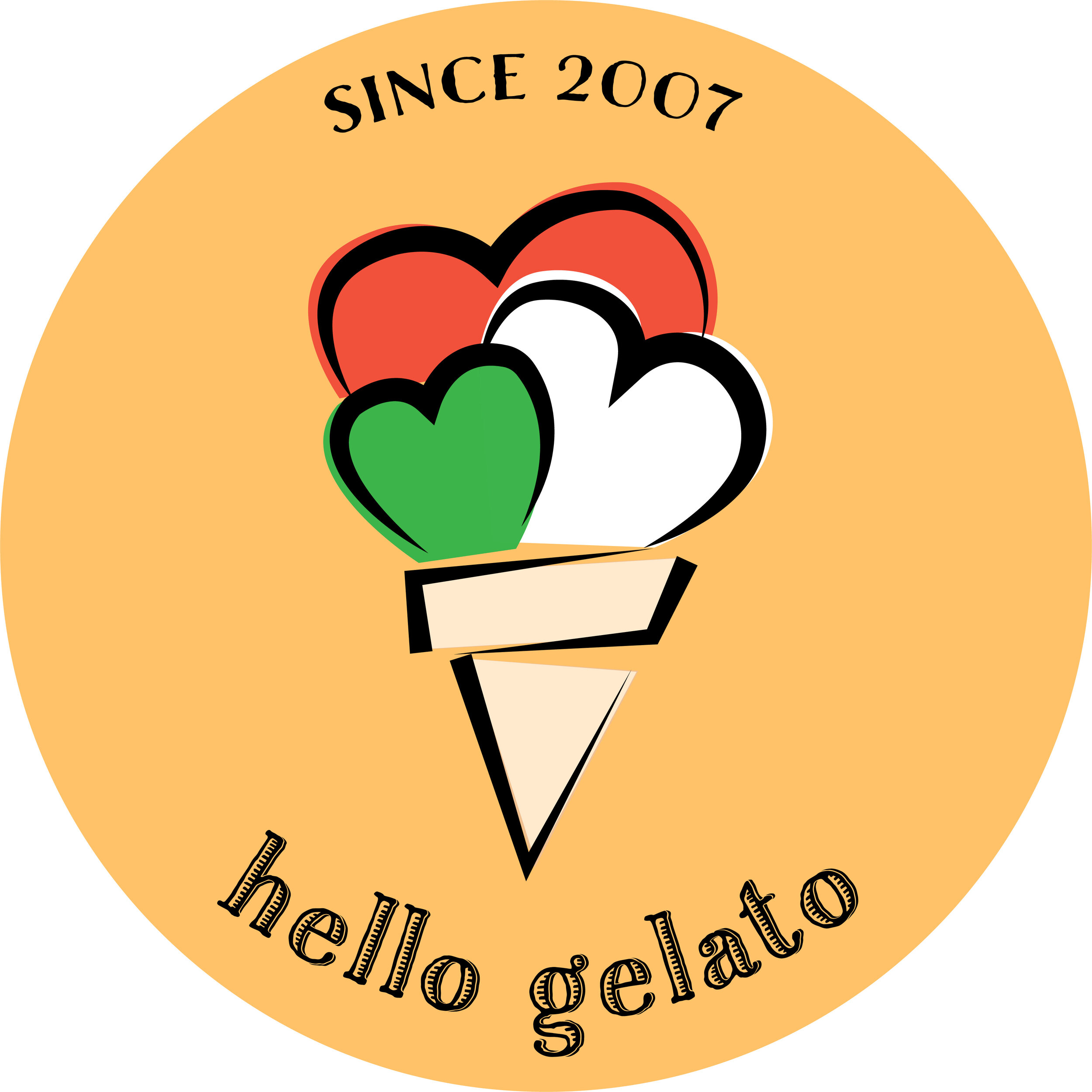
OWNER’S LOGO

Hello Gelato started off as a part of a chain gelato store named Piccomolo. In 2007, the owner needed to change the store because the rest of the Piccomolos had closed down. Now Hello Gelato is a well-known small business located in Old Town Pasadena. There is a couple that runs the store together and they have created their brand to cater towards people of all ages to have a place to come together and get a taste of Italy as they roam the streets in Pasadena. They slowly began the process of rebranding by themselves.
“I want the gelato I make to be a way to spread happiness and love to my community.
That is the reason why I started this business in the first place”
Their gelato is made in house everyday, thus keeping the gelato always fresh and light! Gelato has less air resulting in more flavor along with a flavorful and creamy texture. There are vegan and sugar-free options as well to widen their audience and customers.
INITIAL LOGO IDEAS / MENU BOARD PROTOTYPES


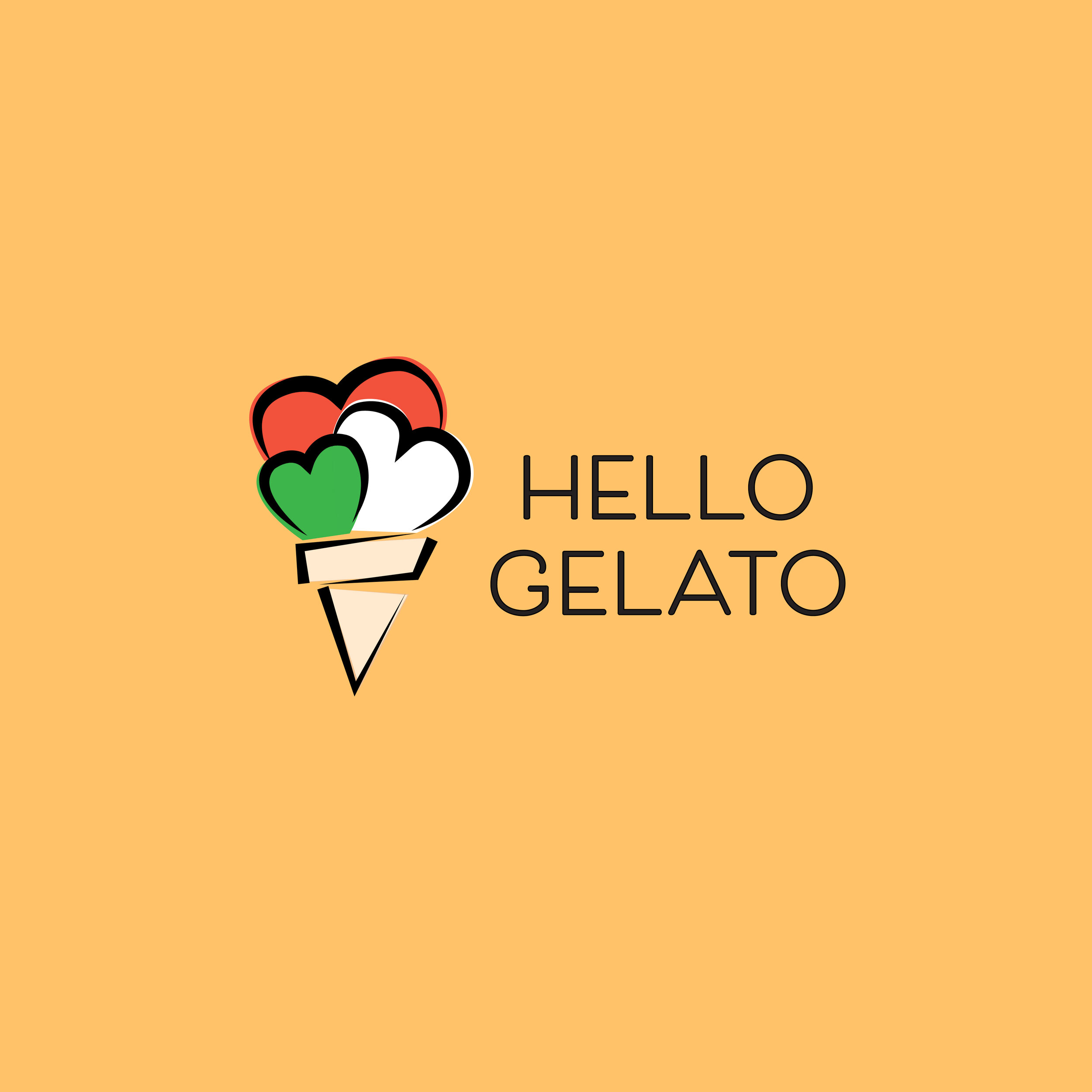
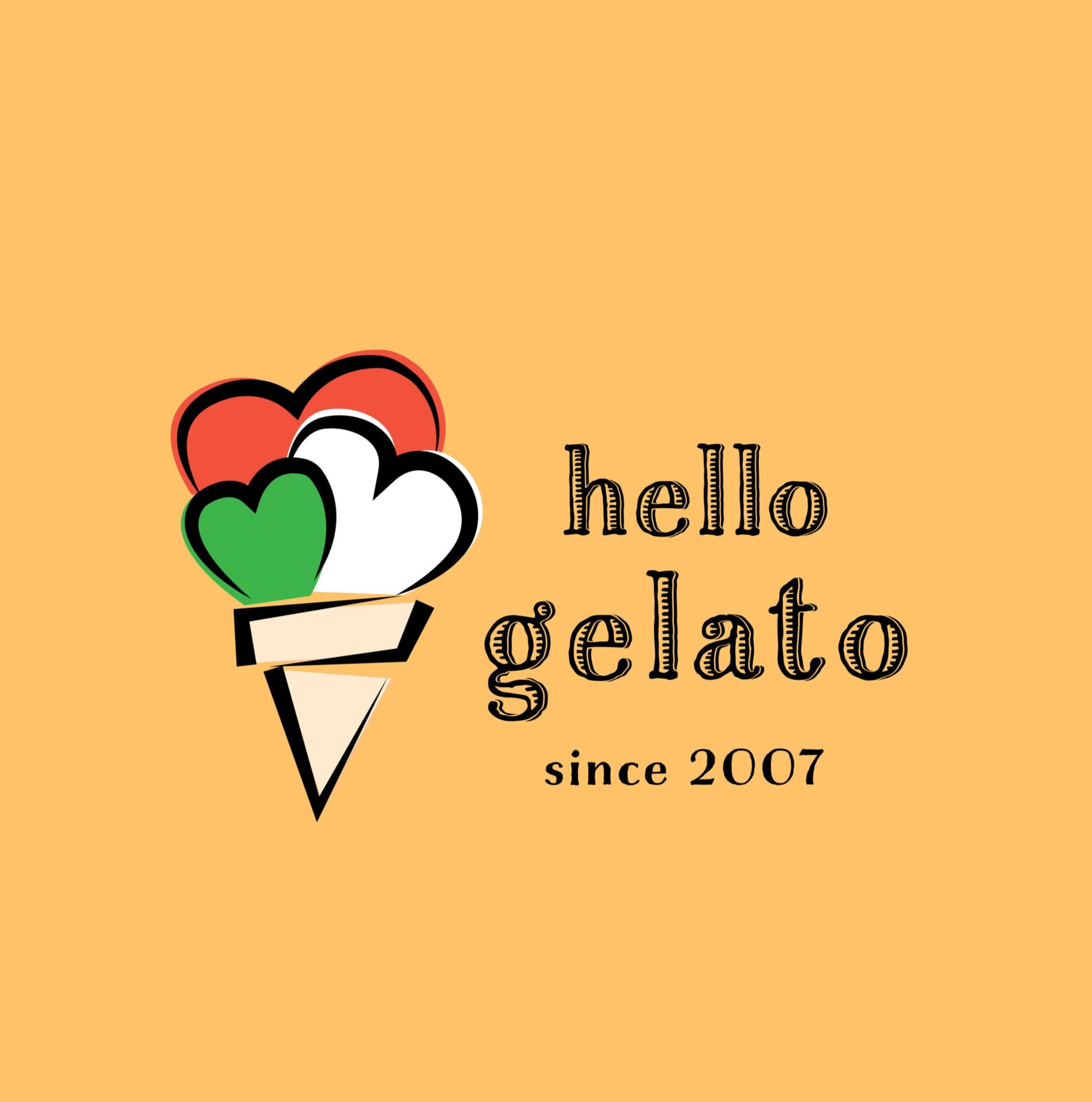


Initially chose blue to represent”ice”, however the owner wanted to incorporate the colors of the Italian Flag, resulting in the hearts being the colors of the Italian flag rather than the background so it less hectic. He had also requested for the “gelato” to be more prominent, therefore, I did not choose the first few because it brings the focus towards “Hello” rather than “gelato”.
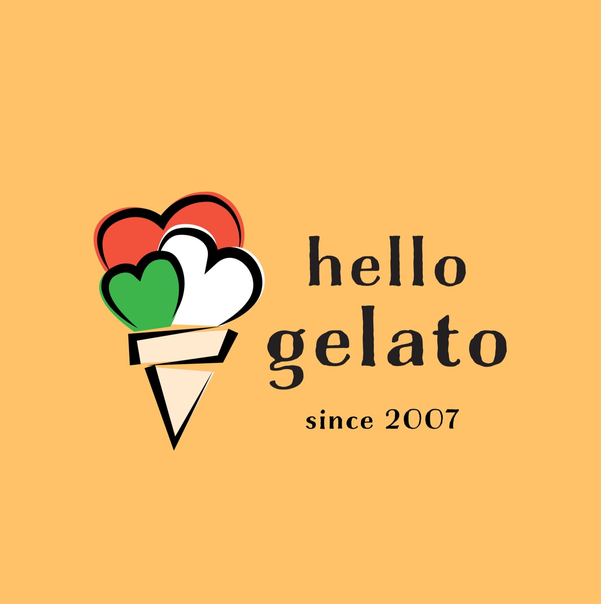
FINAL LOGO DESIGN

The orange creates a pop of color that helps the store signage stand out from the rest of the stores in Old Town Pasadena. The client loved the orange and yellows and urged to implement it throughout the rest of the store for marketing purposes and menu boards. As for the type face, we chose “Charcuterie Etched” to give it a traditional and vintage ambience. They wanted Hello Gelato to be timeless, not just catering to the trend, but to many people for generations to come. I was able to implement it throughout the signage as well.
MARKETING/IN-STORE DELIVERABLES


After coming to a conclusion with the logo and the ambience of the store, the marketing deliverables such as advertising posters and store signage came along smoothly. The client wanted to emphasize that they were different from the other ice cream stores in the city. They wanted “Gelato” to stand out, as they are the only gelato store in the neighborhood, as well as the special characteristics of gelato such as it being low fat, low calorie, authentic, fresh-made and that they had vegan and sugar-free options.